Sunday, February 19, 2012
Recent Publications
Thursday, February 9, 2012
Late Night #1
Research, Research, Research. I probably should have took better notes in high school while learning about plants and photosynthesis, but who knew it would be the main topic of my senior show. The topic I am focusing on is Air purification and targeting homes who deal with indoor air pollution. The next step is to create an identity which is what I believe to be the hardest part. Not anywhere close, but here is a look at some of my ideation...
Sunday, February 5, 2012
5 years later...
A good friend of mine told me a week or so ago that senior show is a marathon and she knows it is one I am ready for. This week begins the third week of my final college semester. It is defiantly going to be a busy one; web design, senior show, other gen eds, two internships that require commuting, and lets not forget my social life! But I am taking it one day at a time or should I say one mile at a time. Senior project is well on its way, last week we needed to have our design brief complete with our topic and research. It is safe to say I have passed mile marker one and on to the next one...the next thing on the list is name, logo design, and identity guideline. I will keep you posted! In these first few weeks I have also wrote my first code ever and style sheet! Organization and time management are going to be the key to this semester. Above was just a little personal project, I figured my family would need a save the date to mark their calendars.
Sunday, January 29, 2012
Finishing Old Business
One week completed of my last semester, I can't believe it is all going to be over. With that said their was a few things left on my to do list before the semester really gets going. Here are two of last semesters packaging projects that I finally finished editing! One is a design for a new vodka brand and the other is a redesign of an Asics shoebox.
Asics Shoebox
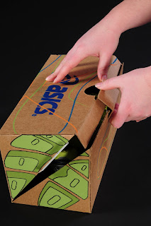
Asics is a number one seller for running shoes. Unfortunately, many runners today are wearing the wrong kind of shoe to support their foot's arch. This redesigned shoebox reduces the size of an original shoebox and creates a system ensuring runners will get the right shoe for their foot. The box opens at the middle of the shoe print, which allows for the distinction between three different arches. The top right corner would be colored blue for overpronators, in other words, individuals who run primarily on the inside of their foot. The bottom left corner would be colored yellow for underpronators, whom normally run on the outside part of their foot. As the box illustrates in the photos above, the entire shoe print is colored green, which represents a normal arch. Along with the design on the outside, the inside shows the colors with a supporting graphic and an explanation. It is intended that these explanations would be located in the store as well to help customers when they are picking out their shoes. This design brings awareness to the problem of choosing the wrong shoe and makes it easy to distinguish which shoe is right for each customer, especially for new runners.

Socialize
Our world today revolves around social media; Facebook, YouTube, Twitter, Google+, and the list goes on. Socialize, a new line of flavored vodka, was developed with the spirit of social media in mind. This bottle allows us to stay connected and interact with the latest video, joke, or picture. The contemporary design was intended to target a younger audience of alcohol consumers, young adults who are sitting around a table with their phone in hand, ready for a conversation starter. By scanning the QR code into their phones, they have been directly connected to the latest link or post everyone is talking about. The design directly relates to the shapes used within the QR code itself.
Asics Shoebox
Asics is a number one seller for running shoes. Unfortunately, many runners today are wearing the wrong kind of shoe to support their foot's arch. This redesigned shoebox reduces the size of an original shoebox and creates a system ensuring runners will get the right shoe for their foot. The box opens at the middle of the shoe print, which allows for the distinction between three different arches. The top right corner would be colored blue for overpronators, in other words, individuals who run primarily on the inside of their foot. The bottom left corner would be colored yellow for underpronators, whom normally run on the outside part of their foot. As the box illustrates in the photos above, the entire shoe print is colored green, which represents a normal arch. Along with the design on the outside, the inside shows the colors with a supporting graphic and an explanation. It is intended that these explanations would be located in the store as well to help customers when they are picking out their shoes. This design brings awareness to the problem of choosing the wrong shoe and makes it easy to distinguish which shoe is right for each customer, especially for new runners.

Sunday, January 8, 2012
Honorable Mention!
In conjunction to other projects this semester our product and packaging design class worked on a collaborative project with three major corporations, 3M, Target, & GNC and two other disciplines; packaging majors and industrial design majors. Each discipline had their own objectives, but we had to work together and collaborate as a team to develop one cohesive look. Each team was given a target audience and a set of constraints by the companies. Our team basically had the chance to design for ourselves because our target audience was college students. The industrial designers role was to design a new dispenser for tape using existing refill rolls of tape, and existing cutter component. Packaging technology's role was to design primary packaging for the product and a store display structure for the tape dispensers. Things to keep in mind were the use of paperboard substrates, a window to see the product while in retail environment, structural integrity for case packing, unitization on a pallet for maximum distribution via least cost and graphic communication that are needed. The Graphic Design's role was to design graphics for the primary package of the tape dispenser and display for a Target End Cap. We had to develop a primary graphic appeal, style and product communication. Things to keep in mind were shelf position and the view of the graphics at retail, a window to see the product while for sale at retail, bar code, product code and other key data needed.
Our team brainstormed many different names and product concepts. We thought the strongest product concept that fit our target audience the best was the idea of a fully enclosed tape dispenser that was completely portable. College students are always on the go and need a heavy duty product that can be tossed around and be protected from outside dust, fuzz, crumbs, etc. Below our product is displayed with a carabiner that can easily be clipped to a backpack. Our brand name that we created, Cocoon, speaks directly about the product and its enclosed features. Our graphics include a simple dot pattern that reflect the grip on the product itself. In attempts to keep this product cheap with college students in mind, we tried to keep production costs down by using only one color, green, on white.
We presented to the corporations twice, once was a in-process presentation and then the final presentation. Each presentation was judged by representatives from the three different corporations. There was a total of seven groups and our group took 3rd place, honorable mention. Below is a combination of 3D renderings and mock-ups of our final designs. Enjoy!

Tuesday, December 6, 2011
A lil Exercise
I am currently working on my final print for serigraphy. I am looking for the perfect typefaces, but just can't seem to find the right combination tonight, so I thought this little exercise was much needed because my words are lacking a personality of their own!
Wednesday, November 16, 2011
TAPE!
For product and packaging class we are currently working on a project for 3M, Target, and GNC. It is a collaborative project with graphic designers, industrial designers, and packaging majors. The project is to design a new tape dispenser and the packaging, graphics, and store display for it. Here are a few concepts that I came up with for the project.
Wednesday, November 2, 2011
Does it make sense?
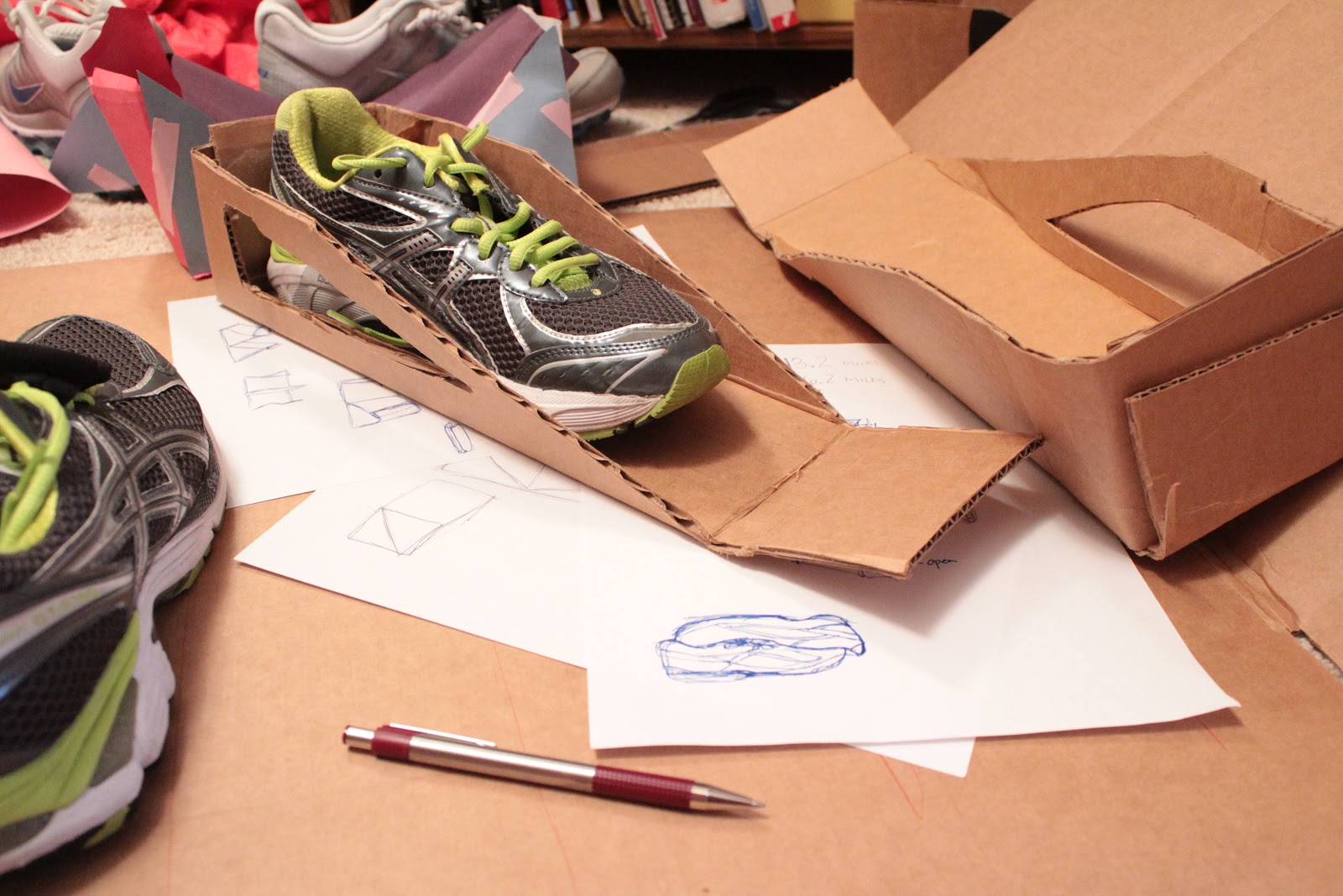
I am working on a system in addition to the structure of the shoe box seen below. The bigger picture is to create a user experience and my focus is buying running shoes in stores with the target audience of new or beg. runners. What shoe should you buy? What shoe is right for your foot & purpose? These are the questions I am trying to answer. The research I have been doing has been an exciting process! I definitely feel more confident in finding the right shoes for me, not to mention I even found myself looking at the bottom of my running shoes to see which areas were the most worn down. I can't wait for the finished product! 3 weeks to go!
Sunday, October 30, 2011
Over the Weekend
Subscribe to:
Posts (Atom)